
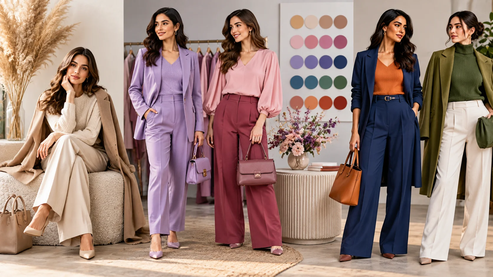
Have you ever put two beautiful pieces together only to feel that something about the outfit looks slightly “off”? The problem may not be either garment. Often, it is the relationship between their colours.
Colour theory in women’s fashion gives you a practical framework for understanding those relationships. Instead of memorising rigid rules, you can use hue, value, intensity and colour-wheel relationships to build outfits that feel more intentional, balanced and visually interesting.
Colour itself is commonly described through three dimensions: hue, value and chroma or intensity. Hue identifies the colour family, value describes how light or dark it is, and chroma describes its strength or purity.
The useful part? You do not need to become a colour expert. A few simple principles can make everyday outfit building much easier.
Table of Contents
Understanding Colour Beyond the Colour Name
Calling something “blue”, “green” or “pink” tells only part of the story.
Two blue garments, for example, can create completely different impressions. One might be pale and muted; another might be deep and highly saturated. That is because colour involves more than hue.
Hue
Hue is essentially the colour family — red, orange, yellow, green, blue, violet and the variations between them.
This is the easiest colour property to recognise, but choosing colours by hue alone can sometimes produce disappointing combinations.
Value
Value describes how light or dark a colour appears.
Think of pale powder blue versus deep navy. Both belong broadly to the blue family, yet they have very different visual weights.
Value can be particularly useful when you want to control contrast. Combining very light and very dark pieces creates a stronger separation, while colours with similar values usually produce a softer transition. Fashion and apparel design resources specifically recognise value as the lightness or darkness of a hue.
Chroma or intensity
Chroma — also called intensity or saturation in different colour systems — refers to how vivid or muted a colour appears.
Electric cobalt and dusty blue may share a colour family, but cobalt has far greater intensity.
This distinction explains why an outfit made entirely from “different colours” can still feel calm when all the shades are muted, while one intensely saturated piece can immediately become the focal point.
The practical lesson: when colours seem difficult to combine, look beyond their names. Compare their lightness, darkness and intensity too.
Five Colour Formulas That Make Dressing Easier
The colour wheel is useful because it shows relationships between hues rather than simply presenting individual colours. Colour-wheel principles are also taught within apparel and fashion design as a way of understanding colour relationships.
Here are five particularly wearable approaches.
1. Monochromatic dressing
A monochromatic outfit works mainly within one colour family.
But that does not mean wearing exactly the same shade from head to toe.
You might combine:
- pale blue with denim blue and navy;
- blush with rose and burgundy;
- cream with beige and deeper caramel-toned accessories.
Varying value and texture helps create dimension while maintaining colour continuity.
This makes monochromatic dressing one of the easiest ways to experiment with colour without introducing several competing hues.
2. Analogous colours
Analogous colours sit close to one another on a traditional colour wheel.
Examples might include:
- blue + blue-green + green;
- red + red-orange + orange;
- violet + blue-violet + blue.
Because the hues are neighbours, the combination can create visual continuity while still giving the outfit more colour variation than a monochromatic palette.
You do not need to use three colours. Two neighbouring colour families can be enough.
For everyday dressing, try allowing one colour to dominate while using the second in a smaller garment or accessory.
3. Complementary colours
Complementary hues sit opposite one another on the colour wheel and therefore create noticeable colour contrast.
The classic relationships include combinations such as blue and orange or red and green.
That does not mean you need to wear their brightest possible versions together.
Instead of vivid orange with electric blue, for example, you could experiment with:
navy + rust
or
soft blue + warm terracotta
Changing the value and intensity makes the underlying relationship much easier to adapt to everyday wardrobes.
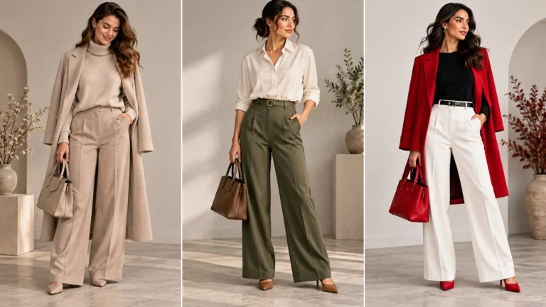
4. Tonal neutrals
Colour theory is equally useful when your wardrobe consists mainly of neutrals.
Try layering:
cream + oatmeal + camel
or
charcoal + grey + soft white
or
chocolate brown + tan + ivory.
The interest comes from changes in value, texture and proportion rather than dramatic hue contrast.
This is why a neutral outfit does not automatically have to look plain.
5. Neutral base + one accent colour
If combining several colours feels intimidating, begin with a neutral foundation.
For example:
black trousers + white shirt + red bag
or
cream dress + tan accessories + green accent
or
denim + white top + cobalt accessory
The neutral pieces create visual breathing room while the accent establishes a clear focal point.
It is also an easy formula for experimenting with a colour that you would not necessarily want to wear across an entire outfit.
How to Control Contrast in an Outfit
One of the most useful ideas in colour theory is that contrast is adjustable.
You are not simply choosing between “matching” and “clashing”.
Consider three different approaches.
Low contrast
Use colours relatively close in value or intensity.
Think:
soft beige + muted sage
dusty pink + soft grey
navy + deep burgundy.
The result can feel restrained because the transitions between colours are less dramatic.
Medium contrast
Introduce a clearer difference while keeping one part of the palette relatively grounded.
For example:
navy + cream
camel + forest green
denim blue + burgundy.
This can be particularly easy to use for everyday outfits because the colour relationship is visible without necessarily dominating the entire look.
High contrast
Pair noticeably light and dark values or visually opposing hues.
Examples could include:
black + white
deep navy + bright yellow
purple + yellow.
High contrast naturally draws attention to the boundaries between colours. Research and educational material on colour design similarly notes that placing light and dark values together creates stronger visual differentiation.
The important question is therefore not simply:
“Do these colours match?”
A more useful question is:
“How much contrast do I want this outfit to have?”
That small change in thinking makes colour decisions far more flexible.
Using Neutrals Without Making an Outfit Boring
Black, white, grey, navy, beige, cream and brown are often treated as the “safe” part of a wardrobe.
They can be much more than that.
Neutrals can function as a visual bridge between stronger colours. If two colourful garments together feel overwhelming, introducing a neutral may make the overall palette easier to manage.
Suppose you like burgundy and green but do not want both colours competing equally. Instead of wearing them in two large blocks, you might build the outfit around cream or charcoal and introduce the other colours in smaller proportions.
Another technique is to vary texture.
A cream outfit combining knitwear, structured cotton, leather-look accessories or fluid fabric can appear more dimensional even when the colour palette remains restrained.
This illustrates an important styling principle: colour does not work independently from fabric, texture, silhouette and proportion.
A Practical Way to Build Your Own Colour Palette
Colour theory becomes most useful when you apply it to clothes you actually wear.
You can start without buying anything new.
Step 1: Find your most-used neutrals
Look through your wardrobe and identify the neutral colours you already rely on.
Perhaps yours are:
- black and white;
- navy and cream;
- beige and brown;
- charcoal and soft grey.
These become your foundation.
Step 2: Identify colours you genuinely enjoy wearing
Forget trend forecasts for a moment.
Which colours repeatedly attract you?
Maybe it is burgundy, cobalt, olive, lavender or rust.
A theoretically “perfect” palette is not useful if you dislike wearing it.
Step 3: Compare value
Place potential combinations next to each other.
Are both colours very dark?
Is one significantly lighter?
Would introducing a lighter or darker neutral improve the separation?
This simple check can explain why two colours sometimes feel visually flat even though their hues appear compatible.
Step 4: Compare intensity
Next, ask whether the colours are similarly vivid or muted.
A bright garment surrounded by muted colours will naturally command more attention.
That can be intentional.
If it is not, repeat its intensity elsewhere in a smaller detail or replace it with a softer variation of the same hue.
Step 5: Decide where the focal point belongs
Instead of distributing several bold colours equally, decide which part of the outfit should attract attention first.
It might be:
- a colourful dress;
- a bright jacket;
- statement footwear;
- a handbag;
- jewellery;
- a scarf.
Then let the remaining colours support that focal point.
Step 6: Photograph the combination
An outfit can sometimes read differently in a photograph than it does when viewed piece by piece.
Taking a quick mirror photo can make the overall distribution of light, dark and intense colours easier to judge.
Over time, you will begin recognising the combinations that work for your wardrobe, rather than depending on a generic list of supposedly perfect pairings.
When to Ignore Colour Theory
Colour theory should make dressing easier — not turn your wardrobe into a mathematics exercise.
Fashion is also personal expression.
You might deliberately combine unexpected colours because you enjoy the result. You may prefer low-contrast dressing one day and bold complementary colours the next. Cultural context, occasion, fabric, print, lighting and personal taste can all change how a palette is perceived.
Even fashion guidance on colour-wheel dressing ultimately leaves room for experimentation with shades and tones rather than treating colour relationships as absolute rules.
So think of the colour wheel as a problem-solving tool, not a fashion rulebook.
When an outfit already feels right to you, you do not need colour theory to justify it.
When something feels wrong, however, colour theory gives you useful questions to ask:
Is the contrast too strong?
Are all the colours competing at the same intensity?
Would changing one colour’s value help?
Does the outfit need a neutral bridge?
Is there a clear focal point?
Those questions are far more useful than searching endlessly for a list of colours you are supposedly “allowed” to wear.
Make Colour Work for Your Wardrobe
Understanding colour theory in women’s fashion is ultimately about gaining more control over the clothes you already own.
Start with hue, value and intensity. Experiment with monochromatic, analogous and complementary relationships. Use neutrals to create breathing room, and decide intentionally whether you want low, medium or high contrast.
Most importantly, treat these ideas as tools rather than restrictions.
The best colour palette is not necessarily the one that follows every theory perfectly. It is the one that helps your wardrobe feel cohesive while still looking unmistakably like you.
FAQs
What is colour theory in women’s fashion?
Colour theory in women’s fashion is a practical way of understanding how colours relate through properties such as hue, value and intensity, as well as relationships on the colour wheel. It can help you build more intentional outfit palettes.
What are the easiest colours to combine in an outfit?
There is no universal perfect combination, but neutrals plus one accent colour, monochromatic palettes and closely related hues are useful starting points. Adjusting lightness and intensity can make many combinations easier to wear.
Do complementary colours always look good together?
Not automatically. Complementary colours create strong contrast, but their value, intensity, proportion and placement also influence the finished outfit. Softer or darker variations can make a complementary pairing feel more restrained.
Can I use colour theory with a mostly neutral wardrobe?
Absolutely. Colour theory includes value and contrast, so it remains useful with black, white, grey, navy, cream, beige and brown. Varying lightness, texture and proportion can add visual depth even without bright colours.
Do I have to follow the colour wheel when choosing clothes?
No. The colour wheel is a guide to relationships between hues, not a set of compulsory fashion rules. Use it when it helps you understand or troubleshoot an outfit, and prioritise personal preference when you already like the result.