
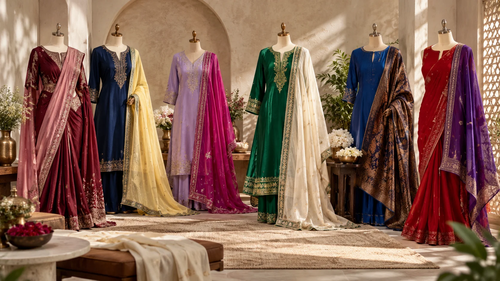
Traditional outfits do not always need a new silhouette, heavier embellishment or more accessories to feel fresh. Sometimes, changing the colour pairing for traditional outfits is enough to make a familiar saree, kurta set, lehenga or festive co-ord feel completely different.
That idea feels especially relevant in 2026. Current fashion is embracing stronger colour relationships rather than relying only on predictable neutrals: saturated blues, reds, purples and burgundy are prominent, while combinations such as navy with yellow, burgundy with rose and lavender with raspberry have appeared in current runway-led fashion coverage.
The useful part is that you do not need to copy a runway look. Treat these colours as inspiration, then apply them to pieces already in your wardrobe.
Table of Contents
Why Colour Can Refresh Traditional Outfits
Traditional clothing often gives you more colour-building opportunities than a simple one-piece outfit. A kurta can interact with a dupatta and trousers; a saree can contrast with its blouse; a lehenga has a blouse, skirt and dupatta; jewellery, footwear and bags create additional accents.
That means refreshing an outfit does not necessarily mean replacing its main piece.
If you own an emerald kurta, for example, you can change its character by moving from a familiar gold combination to ivory. A burgundy saree can feel softer with dusty rose, while navy can gain a brighter festive energy when paired with yellow.
For a deeper explanation of complementary, analogous and tonal relationships, Nimon Group’s Colour Theory Made Practical for Women’s Fashion is a useful companion guide.
Current fashion also provides permission to experiment. British Vogue’s 2026 colour reporting describes designers using more confident colour clashes and treating runway palettes as inspiration rather than rigid rules.
See British Vogue’s 2026 colour-combination report
Six Colour Pairings Worth Trying
1. Burgundy + Dusty Rose
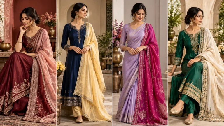
Burgundy already feels rich enough for festive and occasion dressing, but combining it only with gold or black can make the result feel familiar. Dusty rose gives it a softer, more contemporary contrast.
Try a burgundy saree with a muted rose blouse, or a deep wine kurta with a dusty-pink dupatta. If the garment already contains embroidery, repeat only one of those shades in your accessories rather than introducing another dominant colour.
This combination has a current-fashion connection too: burgundy and rose appeared among British Vogue’s highlighted 2026 pairings, while burgundy remains visible in autumn/winter 2026 collections. 📖
Style tip: Let burgundy carry most of the visual weight and use rose as the secondary shade.
2. Navy + Butter Yellow
Navy is an excellent foundation when you want colour without losing polish. Butter or soft yellow can lift it without creating the sharper contrast of bright white.
A navy kurta with a muted yellow dupatta is an easy starting point. With a saree, you could reverse the balance: use yellow as the main colour and bring navy into the blouse.
Navy and yellow appeared as a notable 2026 combination in British Vogue’s spring/summer reporting, while butter yellow has continued to feature in 2026 collections.
Keep jewellery comparatively restrained if both colours are clearly visible.
3. Lavender + Raspberry
This is the pairing for someone who wants traditional clothing to look more expressive without immediately moving towards orange, red or bright pink.
Lavender creates the softer base; raspberry provides depth.
Try a lavender kurta set with a raspberry dupatta, or use a raspberry blouse to interrupt a predominantly lilac or lavender saree. If you are hesitant about wearing both colours in large blocks, keep the second shade to the border, bag or footwear.
Lavender and raspberry was another combination identified in British Vogue’s 2026 runway colour analysis.
4. Emerald Green + Ivory
Not every refreshing colour combination has to be loud.
Emerald and ivory work through contrast between a saturated jewel tone and a quiet neutral. That makes the pairing especially useful when embroidery, woven motifs or jewellery already add plenty of detail.
An emerald kurta with ivory trousers and dupatta can feel cleaner than an all-green ensemble. With an ivory saree or lehenga, an emerald blouse or border can become the focal point.
Emerald has also appeared among the notable colours in 2026 runway reporting. 📖
Style tip: When the green is intense, give ivory enough visible area to act as breathing space rather than reducing it to a tiny accent.
5. Cobalt Blue + Chocolate Brown
Blue and brown may not be the first combination associated with traditional occasionwear, which is precisely why it can make an existing outfit feel different.
British Vogue highlighted brown and blue as an important 2026 pairing, noting examples ranging from sky blue with mahogany brown to highly saturated blue grounded by brown. 📖
For traditional clothing, translate the idea rather than copying the exact runway styling. A cobalt kurta could work with a deep brown bag or footwear; a blue saree could be paired with a chocolate-brown blouse if the undertones and fabric finishes sit comfortably together.
If that feels too experimental, tan or antique-gold accessories can provide a gentler bridge between the two colours.
6. Red + Purple
Red and purple create the strongest contrast in this group, so proportion matters.
Instead of dividing the outfit equally between the two, choose a dominant colour. A red saree with a deep-purple blouse, a purple kurta with a red dupatta, or a largely neutral traditional outfit with controlled red and purple accents can feel more intentional.
The combination has had visible fashion momentum in 2026, appearing across runway and celebrity styling coverage. 📖
This pairing is particularly useful when you want an existing festive outfit to feel dramatically different without changing its core garment.
How to Make a Bold Colour Pairing Feel Balanced
The easiest mistake is assuming that two fashionable colours automatically create a successful outfit.
They do not.
Think about proportion first. One colour can lead while the second supports it. A third neutral — ivory, cream, tan, brown, black or metallic — can sometimes give the eye somewhere to rest.
Also consider the visual activity already present in the garment. A plain kurta can usually accommodate stronger colour blocking more easily than an intricately printed or heavily embroidered piece.
With a multicoloured saree, for example, it may be more effective to extract one existing shade for the blouse and another small shade for accessories rather than adding two completely unrelated colours.
Nimon Group’s existing multicoloured Kanjeevaram styling content uses the same broader principle of allowing the saree’s existing colour story to guide supporting styling rather than making every element compete.
Use Accessories as the Colour Bridge
You do not have to commit to a contrasting blouse or dupatta immediately.
Accessories are an easier testing ground.
Imagine a navy kurta you normally wear with metallic accessories. Before buying another garment, introduce yellow through a potli, bangles or footwear. If you like the relationship, you can later experiment with a yellow dupatta.
The same approach works with:
- burgundy clothing + dusty-rose bag
- lavender clothing + raspberry footwear
- ivory clothing + emerald earrings or bag
- cobalt clothing + chocolate-brown footwear
- red clothing + controlled purple accent
Jewellery should not automatically become another competing colour. When the clothing already contains two strong shades, a coherent metal finish or a restrained jewellery palette often keeps the overall composition clearer.
Refresh What You Already Own
The most useful colour pairings for traditional outfits are not necessarily the combinations that require another shopping trip.
Start with one traditional piece you already wear regularly.
Place it next to two or three dupattas, blouses, bags or pairs of footwear that you normally would not combine with it. Look for either a deliberate contrast or a clear tonal relationship rather than trying to make every shade match exactly.
For 2026, fashion’s broader move towards expressive colour makes this experimentation particularly timely. Jewel tones are being styled beyond their conventional formal context, including with cleaner, more casual and unexpected companions. 📖
The goal, however, is not to make an outfit look trendy for a single season. It is to discover new relationships between clothes you already enjoy wearing.
A familiar saree may only need an unexpected blouse. A plain kurta may need a contrasting dupatta. A monochromatic festive set may only need one carefully chosen accessory colour.
That is often enough to make traditional dressing feel new again.
Related Blogs
Beautiful Colour Theory Made Practical for Women’s Fashion — a useful next step for understanding how complementary, analogous and tonal colour relationships work in outfits.
Multicoloured Kanjeevaram Saree With Elegant Standout Style — useful inspiration when the garment already contains several colours and the styling challenge is deciding which ones to repeat.
FAQs
What colour pairings for traditional outfits look fresh in 2026?
Burgundy with dusty rose, navy with butter yellow, lavender with raspberry, emerald with ivory, cobalt with brown and red with purple all provide useful starting points. The best choice still depends on the garment, occasion and colours you enjoy wearing.
Do contrasting colours work with traditional outfits?
Yes. Contrast can make traditional clothing feel more contemporary, but one shade usually works better as the dominant colour while the second acts as support or an accent.
How can I refresh a saree without buying another one?
Try changing the blouse colour first. You can also alter the jewellery, bag, footwear or styling of the pallu. A different supporting colour can significantly change the visual character of the same saree.
Should my jewellery match my outfit colours?
Not necessarily. Jewellery can coordinate with one shade, echo embroidery or provide a neutral metallic finish. With a strongly coloured outfit, simpler jewellery can prevent too many elements from competing.
How many colours should I use in one traditional outfit?
There is no universal maximum. A practical starting point is one dominant shade, one supporting shade and, when needed, a quieter neutral or metallic accent. Printed and multicoloured textiles can naturally contain more colours, so judge the whole composition rather than following a rigid number.