This article may contain affiliate links. We may earn a commission at no extra cost to you.
A good graphic T-shirt can do far more than fill the casual corner of your wardrobe. Choose the right colour, print and styling combination, and it becomes the piece that gives an otherwise simple outfit its personality.
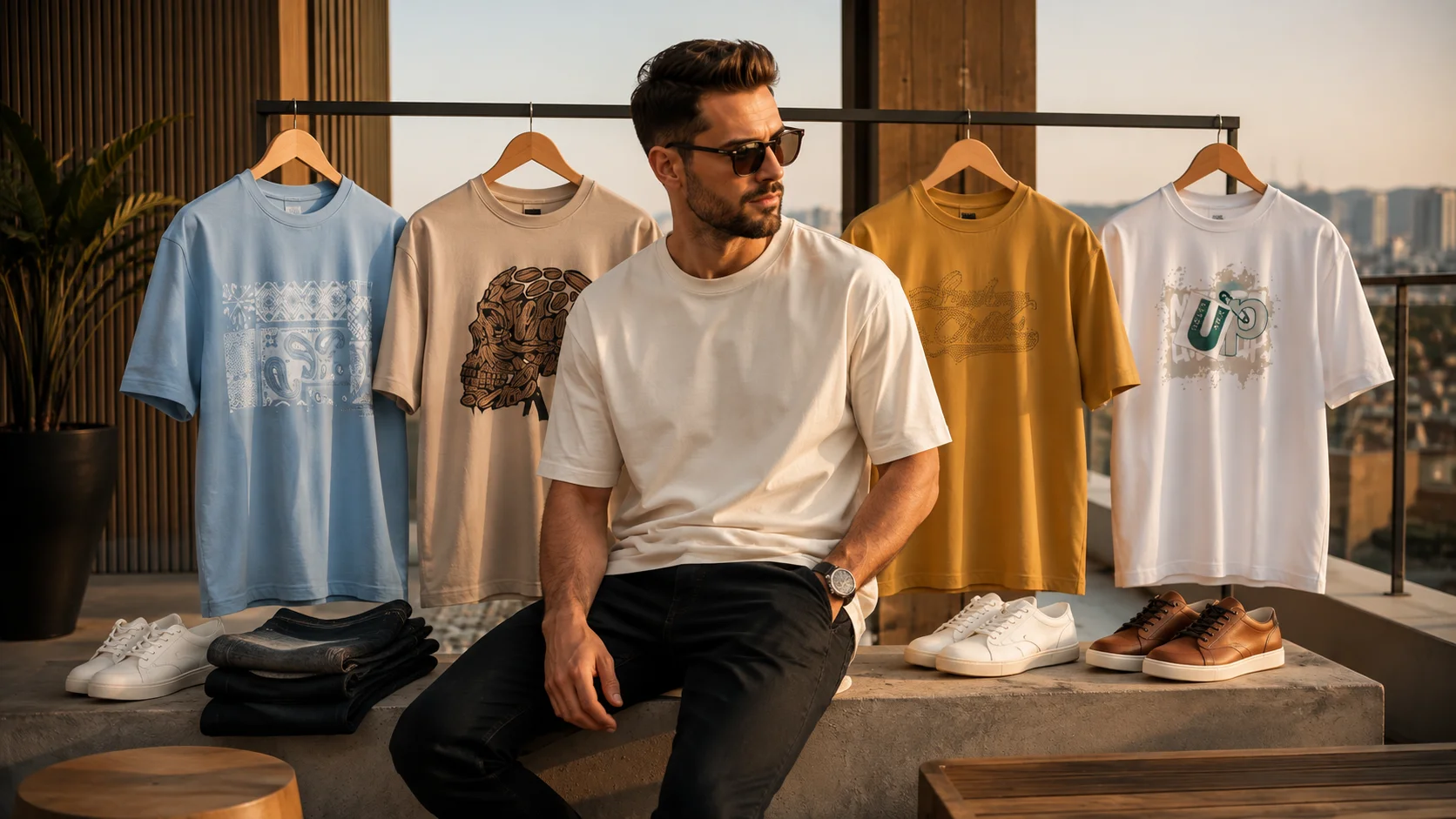
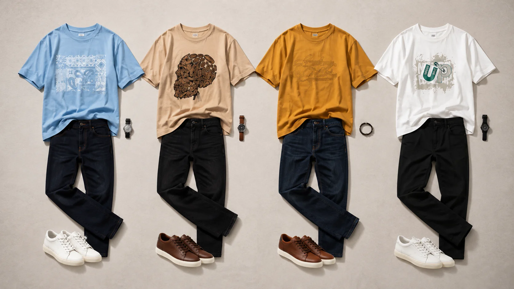
The four looks here show exactly why graphic tees remain useful men’s wardrobe essentials: chambray blue brings a fresh, relaxed feel; warm beige creates an easy coffee-run aesthetic; mustard gold adds understated colour; and crisp white gives a graphic print maximum contrast.
The easiest way to wear graphic T-shirts well is to let the tee provide the personality while the rest of the outfit stays controlled. Dark denim, black trousers, neutral trainers and restrained accessories can make even a playful print feel considered rather than overdone.
Table of Contents
Why Graphic T-Shirts Still Earn Their Wardrobe Space
There is a reason the graphic tee keeps returning to everyday menswear. It sits somewhere between a plain basic and a statement piece.
A plain T-shirt often relies on cut and colour to create interest. A graphic tee already has a visual focal point, so it can make a straightforward jeans-and-trainers combination feel more intentional without requiring complicated layering.
That makes it particularly useful on those days when you want to look put together but do not want to spend much time building an outfit.
The trick is avoiding unnecessary competition.
If the front graphic is detailed, large or typographic, you usually do not need another strong pattern elsewhere. Instead, allow the print to carry the outfit and use simpler pieces around it.
This is where an oversized or relaxed silhouette can work particularly well visually. It creates an easy contemporary shape and gives the graphic enough space to become part of the overall look.
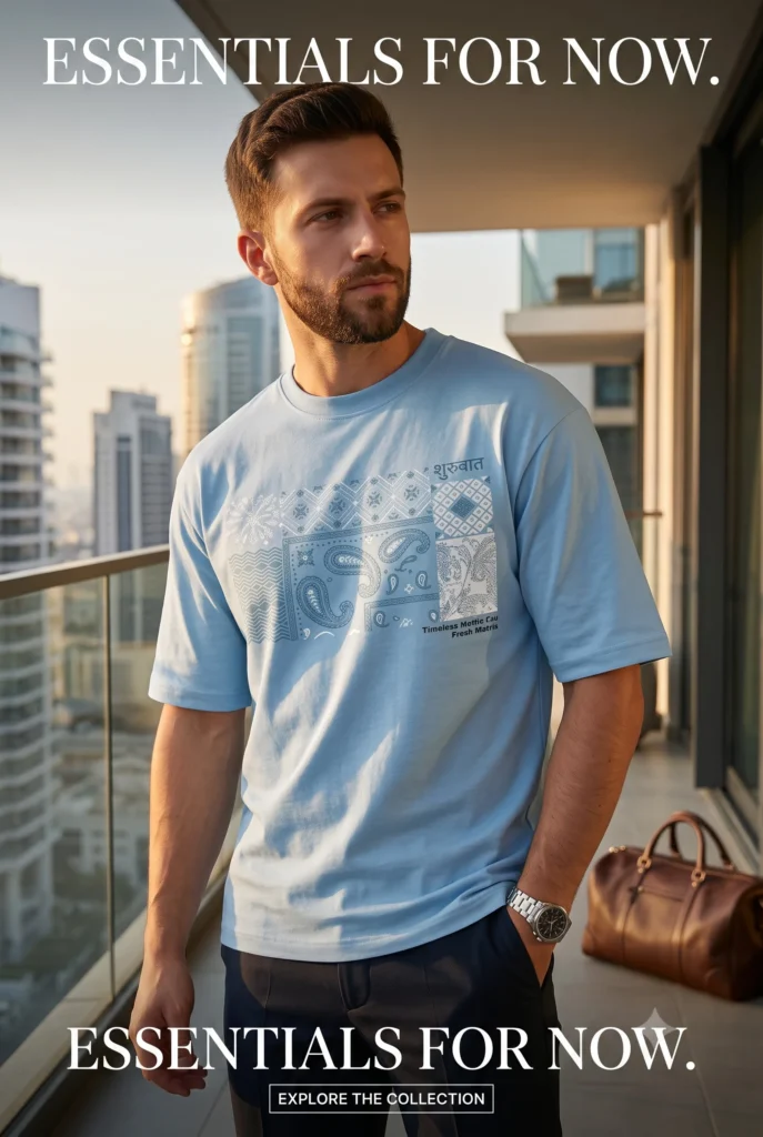
Bewakoof Mens Chambray Blue Motif Graphic Printed Oversized T-Shirt
Explore Style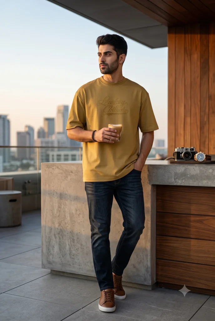
Bewakoof Mens Mustard Gold Yellow Lowkey Chilling Typography Oversized T-Shirt
Explore Style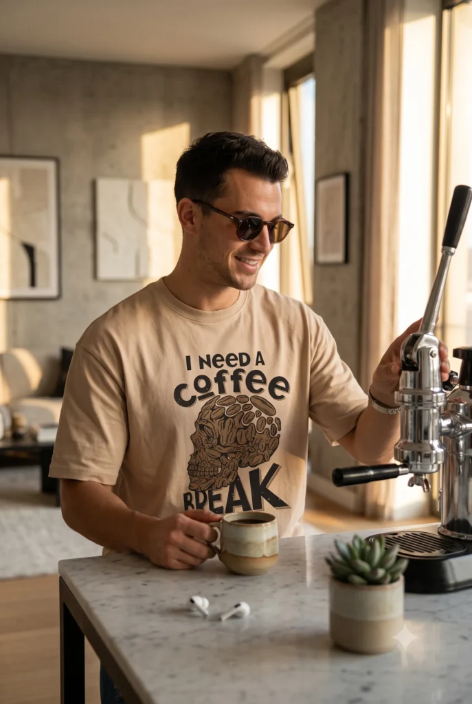
Bewakoof Men’s Warm Beige Coffee Break Printed Oversized T-Shirt
Explore Style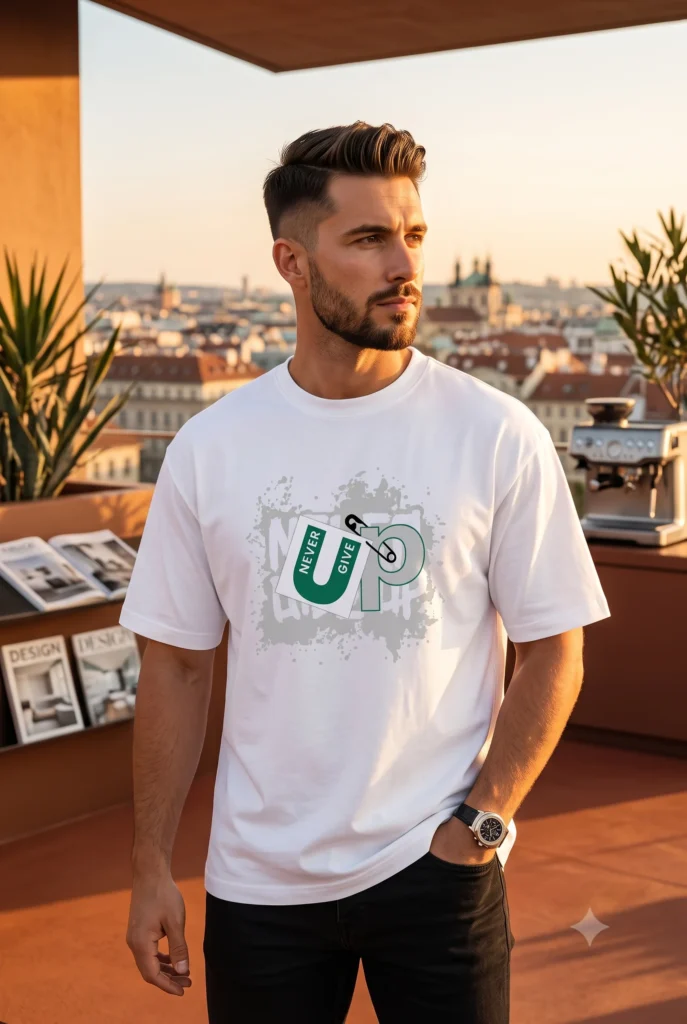
Bewakoof Men’s White Never Give Up Typography Oversized T-Shirt
Explore StyleFour Colours, Four Different Styling Moods
The interesting thing about these tees is that the graphic is only part of the story. Colour changes the entire mood of the outfit.
Chambray blue for a fresh everyday look
A pale chambray-style blue feels light, approachable and easy to coordinate. Paired with dark bottoms, it creates enough contrast to keep the outfit sharp while maintaining a relaxed character.
Try it with dark navy or black trousers and clean trainers. If you prefer denim, choose a noticeably darker wash than the tee so the outfit does not visually merge into one shade.
Silver-tone accessories can complement this cooler palette without competing with the chest graphic.
Warm beige for an easy coffee-run outfit
Beige graphic tees have a naturally understated quality, even when the artwork itself is bold.
That balance makes them particularly easy to use for casual weekends, café outings or relaxed daytime plans. Black jeans can create stronger contrast, while dark brown, olive or deep indigo bottoms give the look a softer finish.
The coffee-inspired graphic adds personality, so there is little need for excessive accessorising. Sunglasses, a watch and uncomplicated footwear can be enough.
Mustard gold when neutrals feel too predictable
Mustard is a useful alternative for anyone whose wardrobe is dominated by black, white, navy and grey.
It introduces colour without necessarily demanding an elaborate outfit around it. Dark indigo denim works particularly well because the deeper blue visually anchors the warmer top.
Brown-toned casual shoes can also connect naturally with the earthy character of mustard.
If you are experimenting with stronger colours for the first time, this is a useful formula to remember:
one noticeable colour + one dark neutral + restrained accessories.
It keeps the outfit interesting without making it busy.
White for maximum graphic contrast
A white graphic tee is perhaps the easiest starting point because almost everything works around it.
Black bottoms create a clean monochromatic foundation and allow coloured elements in the graphic to stand out. Dark denim softens the contrast, while lighter neutral trousers can move the look towards a brighter daytime aesthetic.
Because white provides such a clean visual base, pay attention to the graphic itself. If the design is already prominent, keep shoes and accessories relatively simple.
How to Style Graphic T-Shirts Without Looking Overdone
Graphic tees become harder to style when too many pieces compete for attention.
Imagine a bold front graphic paired with heavily distressed jeans, statement trainers, a patterned jacket and several oversized accessories. Each element may work independently, but together they can fight for visual priority.
A more reliable approach is to decide what the hero piece will be.
When that hero is the T-shirt, build everything else around it.
For an uncomplicated everyday outfit, try:
Graphic tee + dark jeans + clean trainers + watch
For something slightly sharper:
Graphic tee + straight or tailored casual trousers + minimal trainers + lightweight overshirt
For cooler weather:
Graphic tee + open neutral overshirt + dark denim + simple casual footwear
The graphic should still remain visible enough to contribute to the outfit rather than disappearing beneath several layers.
Fit also matters visually. With a relaxed or oversized tee, cleaner trousers can provide useful balance. Wearing extremely loose pieces from top to bottom can work as a deliberate streetwear silhouette, but it requires more attention to proportions.
For an easier everyday approach, relaxed on top and cleaner through the lower half is a dependable combination.
The Small Details That Make Casual Outfits Look Better
Casual style rarely depends on one dramatic change. Often it is the collection of small decisions that separates an outfit that simply looks comfortable from one that looks considered.
Watch the colour repetition
You do not need every colour to match, but subtle repetition creates cohesion.
If a graphic includes green, brown or blue, you can echo that tone quietly through footwear, a watch strap or another small accessory. It should feel connected rather than perfectly coordinated.
Keep footwear appropriate to the mood
Minimal trainers are an obvious partner for graphic tees, but they are not the only option.
Brown casual sneakers can complement mustard and earthy shades. Black trainers can sharpen a white tee and dark-bottom combination. Clean white footwear can brighten blue or beige outfits.
The aim is not to find a universal shoe; it is to choose footwear that supports the overall colour story.
Give the graphic some breathing room
A graphic design needs visual space.
Crossbody bags, scarves, heavily layered necklaces or zipped jackets can sometimes cover the main artwork and weaken the reason you chose the tee in the first place.
When the print is the defining feature, avoid unnecessarily hiding it.
Use accessories as punctuation, not paragraphs
A watch, sunglasses or a simple bracelet can finish a casual outfit beautifully. You rarely need all possible accessories at once.
This restraint becomes especially useful when the T-shirt already includes typography or a detailed illustration.
Building a Useful Graphic Tee Rotation
You do not need a wardrobe full of near-identical graphic T-shirts. A smaller rotation with genuinely different colours and visual moods can give you more styling possibilities.
Think in terms of roles rather than quantity.
A light blue tee can cover fresh daytime styling. A warm neutral such as beige gives you something softer and easy to combine with earthy colours. A mustard or similarly muted statement shade introduces controlled colour. A white graphic tee acts as the versatile option that works across a broad range of casual combinations.
Once you have distinct roles, you can reuse the same core bottoms.
One pair of dark jeans, for example, can look noticeably different with each of these colours. Add black trousers or another neutral bottom and the number of workable combinations increases again.
This is a much more practical way to approach casual clothing than buying individual outfits that only work in one fixed combination.
Bewakoof Men’s White Never Give Up Typography Oversized T-Shirt
Check OptionsBewakoof Men’s Warm Beige Coffee Break Printed Oversized T-Shirt
Check OptionsBewakoof Mens Mustard Gold Yellow Lowkey Chilling Typography Oversized T-Shirt
Check OptionsBewakoof Mens Chambray Blue Motif Graphic Printed Oversized T-Shirt
Check OptionsChoosing the Right Graphic T-Shirt for Your Style
Start with the question you will actually face when getting dressed: Where would I wear this?
If your everyday wardrobe is subtle, a blue or beige design may integrate more naturally. If you enjoy colour but still want easy combinations, mustard offers more visual impact without requiring complicated styling. If maximum versatility matters, white remains difficult to beat.
Then consider the artwork.
Typography can create a playful or conversational mood. Illustrative graphics feel more visually expressive. Tonal designs, where the graphic stays relatively close to the colour of the T-shirt, tend to create a quieter effect.
None is automatically better. The best choice is the one that fits naturally with clothes you already own.
Also look at the overall silhouette rather than focusing only on the print. A relaxed T-shirt changes how an outfit reads, particularly when combined with jeans or trousers. Consider whether you prefer a loose casual shape or something visually cleaner and more structured.
Most importantly, resist buying a graphic tee simply because the artwork looks interesting in isolation. Picture at least two or three combinations using your existing wardrobe.
If those outfits come to mind immediately, the tee has a much better chance of becoming something you actually wear.
Make the Graphic Tee Work Harder
The most useful casual clothes are rarely the loudest. They are the pieces that can create several convincing outfits without requiring a completely different wardrobe around them.
Graphic T-shirts fit that description surprisingly well.
Keep the surrounding outfit clean, use colour deliberately and allow the graphic to become the focal point. Whether you prefer fresh blue, understated beige, warm mustard or versatile white, the same principle applies: personality on the tee, restraint everywhere else.
That combination can turn one of menswear’s simplest pieces into a stylish everyday essential.
Frequently Asked Questions
1. Are graphic T-shirts good men’s wardrobe essentials?
Yes. Graphic T-shirts can be useful men’s wardrobe essentials when their colours and designs coordinate with bottoms and footwear you already own. A few genuinely different options are usually more versatile than many similar prints.
2. What trousers look best with graphic T-shirts?
Dark jeans, black trousers and simple neutral casual trousers are dependable choices. The best option depends on the tee colour and the level of contrast you want.
3. How do you make a graphic tee look more stylish?
Keep the rest of the outfit visually controlled. Clean footwear, well-coordinated bottoms and one or two understated accessories allow the graphic to remain the focal point.
4. Can oversized graphic T-shirts be worn with jeans?
Absolutely. A relaxed graphic tee can pair naturally with jeans. For an easy balanced silhouette, try a roomier top with relatively clean, less bulky denim.
5. What colour graphic T-shirt is easiest to style?
White is exceptionally versatile, while light blue and beige are also easy to combine with dark neutrals. Mustard works well when you want more colour while keeping the rest of the outfit understated.