
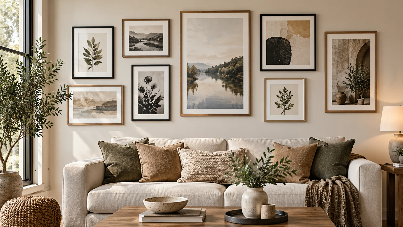
A beautiful gallery wall rarely depends on owning perfectly matching frames or expensive artwork. Gallery wall spacing has a much bigger influence than many people realise: when the gaps, overall scale and visual balance work together, even a varied collection can feel intentional.
A practical starting point is to keep most neighbouring frames around 2–3 inches (approximately 5–7.5 cm) apart, then adjust for frame size, wall scale and the effect you want. Current gallery-wall guidance commonly uses this range, while emphasising that consistency matters more than chasing one supposedly perfect measurement. 📖 📖
The simplest approach is therefore not to hang one frame at a time. Plan the entire arrangement as one composition, test it first and only then transfer it to the wall.
Table of Contents
Why Gallery Wall Spacing Matters
Spacing is effectively the negative space in your gallery wall. Too much empty space can make individual pieces appear disconnected; too little can make a collection feel visually crowded.
What matters most is the relationship between the frames.
For a neat grid, repeating the same gap horizontally and vertically creates a strong visual rhythm. For an organic arrangement with different frame sizes, the edges will naturally vary, but the gaps should still look deliberate rather than accidental.
Current design guidance commonly recommends roughly 2–3 inches between frames as a useful residential starting point. Some guidance suggests tighter spacing for small pieces and more breathing room for oversized work. 📖 📖
Think of those numbers as a planning range rather than a universal rule. Your frame dimensions, wall size, furniture and room proportions should ultimately guide the final choice.
Start with the Whole Wall, Not Individual Frames
One of the easiest mistakes is deciding where the first picture looks good and then trying to fit everything else around it.
Reverse the process.
Measure the usable wall area first. If the gallery will sit above a sofa, console, bed or other furniture, consider the furniture and gallery together rather than treating the wall as an isolated rectangle.
Then measure the frames themselves and create a rough footprint for the complete arrangement.
This gives you three useful boundaries:
- the maximum width available;
- the approximate height of the collection;
- the visual centre of the whole arrangement.
The result is much easier to control because you are positioning one composition rather than several unrelated objects.
Current gallery-wall planning guidance similarly recommends laying out the complete arrangement before fixing anything permanently to the wall. 📖 📖
How to Choose Gallery Wall Spacing
There is no single measurement that suits every collection, but you can make the decision surprisingly simple.
Start around 2–3 inches
For many medium-sized frames, begin by testing gaps of roughly 2–3 inches or 5–7.5 cm.
The advantage of starting here is not that the measurement is magically perfect. It simply gives you enough separation for individual pieces to remain distinct while keeping them visually connected as a group. Multiple current gallery-wall guides use this as their practical baseline. 📖 📖
Tighten the spacing for smaller pieces
A collection of small prints or photographs may look fragmented if every piece is surrounded by a large amount of blank wall.
Try moving the pieces slightly closer together.
The important question is: does your eye read the collection as one arrangement or as several unrelated pictures?
Give oversized frames more room
Large pieces have greater visual weight. A little additional breathing room can prevent them from competing with one another.
Again, scale matters more than blindly following a number.
Keep the visual rhythm consistent
This is arguably more important than deciding between two inches and three.
If one gap is narrow, the next is much wider and another is somewhere in between without an intentional reason, the composition can appear unsettled.
For a grid, consistency should be particularly precise.
For an organic layout, you have more freedom, but repeated or closely related gaps still help connect the collection.
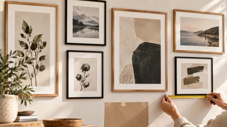
Build the Layout Before You Hang Anything
The safest place to experiment is not the wall.
It is the floor.
Place your frames on a clear floor area and begin arranging them within roughly the same dimensions as the wall space you measured. Start with the largest or most visually important piece and gradually introduce the remaining frames.
Take a photograph of each promising arrangement. Looking at the layout through a phone screen can make awkward gaps and visual imbalances easier to notice.
Once you have a composition you like, measure the spaces between frames.
An even more controlled method is to make paper templates matching the outside dimensions of your frames. Position those templates on the wall with removable tape before committing to fixings. Paper-template planning is also recommended in current gallery-wall installation guidance because it allows the full composition to be checked before holes are made. 📖
Make one simple spacer
Once you settle on a gap, cut a small piece of cardboard to exactly that width.
Instead of repeatedly measuring every space with a tape measure, use the cardboard as a temporary spacer between neighbouring templates.
It is a small trick, but it can make a grid or tightly controlled layout considerably easier to reproduce.
Use an Anchor to Control Visual Balance
A gallery wall does not necessarily need one enormous central picture, but having a visual anchor can simplify the arrangement.
The anchor might be:
- the largest frame;
- the darkest artwork;
- the strongest colour;
- a photograph with particularly high contrast;
- or simply the piece you want viewers to notice first.
Place that piece first in your floor layout, then build around it.
With a symmetrical grid, the geometry itself becomes the organising principle. In a more relaxed salon-style arrangement, the anchor helps prevent different sizes and orientations from feeling random.
Current gallery-wall guidance likewise describes both structured grids and more organic arrangements as workable approaches; the appropriate choice depends on the collection and the character of the room.
Balance visual weight, not just frame dimensions
Two frames can have similar dimensions yet feel completely different.
A dark photograph in a thick black frame can appear visually heavier than a pale print surrounded by a wide white mount. That means mathematically symmetrical positioning does not always create visually balanced results.
Stand back frequently while planning.
If one side looks noticeably heavier, move a darker or larger piece towards the opposite side rather than adding another frame merely to fill space.
Common Gallery Wall Spacing Mistakes
Measuring each gap differently
Small inconsistencies become surprisingly obvious once an entire wall is visible.
Choose a spacing system first and repeat it wherever the layout allows.
Spreading the collection too far apart
Extra wall space does not have to be filled.
If widening the gaps causes the artwork to stop reading as one collection, keep the gallery more compact and allow blank wall around the outside.
Hanging before testing
A layout that works on the floor can look different once it is vertical and surrounded by furniture.
Paper templates provide a low-commitment preview.
Ignoring furniture below the gallery
A gallery wall above a sofa or console should visually relate to the furniture beneath it.
Do not centre the collection on the entire wall automatically if the furniture grouping is clearly the room’s stronger visual reference.
Trying to make every piece identical
Consistency does not necessarily mean uniformity.
Mixed frames, photographs, illustrations and artwork can work together beautifully when another element creates continuity — such as repeated spacing, a restrained colour palette, similar mounts or a clear overall silhouette.
A Simple Planning Sequence
If all the measurements and design possibilities feel complicated, use this order:
Measure → arrange → choose the gap → test → mark → hang.
Measure the available wall and the frames. Arrange everything on the floor. Choose a repeatable gap. Test the layout with paper templates. Mark fixing positions only when you are satisfied with the complete composition.
This method makes gallery wall spacing much easier because the permanent installation becomes the final step rather than the experiment.
The best gallery wall is not necessarily the one following the most rules. It is the one where the art, negative space, furniture and room feel intentionally connected.
Further Reading
For broader art and design inspiration, the Smithsonian’s Art & Design collections provide useful visual reference material: Smithsonian Art & Design. The Smithsonian describes itself as a museum, education and research complex spanning arts, sciences and humanities.
FAQs
What is good gallery wall spacing between frames?
For many residential arrangements, gallery wall spacing of around 2–3 inches (5–7.5 cm) is a practical starting point. Adjust it to suit frame scale, wall dimensions and the desired visual effect.
Do all gallery wall frames need equal spacing?
A formal grid benefits greatly from consistent gaps. Organic arrangements can accommodate more variation, but the spacing should still look intentional and visually connected.
Should I arrange a gallery wall on the floor first?
Yes. A floor layout lets you change positions repeatedly without making holes. Paper templates can then help you preview the final arrangement directly on the wall.
Where should I start when arranging different frame sizes?
Start with the largest or most visually dominant piece as an anchor, then position smaller pieces around it while watching the overall visual weight.
Can a gallery wall use different frame styles?
Yes. Different finishes, sizes and orientations can work together. Repeated spacing, related colours, similar mounts or a controlled overall shape can provide the visual connection.