

This article may contain affiliate links. We may earn a commission at no extra cost to you.
Choosing colours becomes much easier once you stop looking at every shade individually and start thinking in warm, cool and neutral colour families.
Warm colours usually lean towards reds, oranges and yellows, while cool colours tend towards blues, greens and violets. Neutral shades such as black, white and grey sit outside the traditional chromatic wheel and can help anchor stronger colours.
For everyday dressing, the useful question is not whether one colour family is universally “better”. It is whether a particular mix creates the mood, contrast and wardrobe versatility you want.
Table of Contents
Warm, Cool and Neutral Colours Explained
Colour temperature is a practical way to organise a wardrobe.
A colour can feel warm, cool or somewhere in between depending on its undertone and what it is paired with. Adobe notes that colour temperature can be relative: two shades from the same colour family can still appear warmer or cooler beside one another.
That is why a wardrobe does not need to fit into rigid boxes.
Warm colours
Warm palettes often include shades such as:
- Rust
- Terracotta
- Camel
- Mustard
- Burnt orange
- Warm cream
- Golden brown
- Olive with a yellow undertone
These colours tend to create an earthy, rich or energetic impression.
In a wardrobe, warm shades work particularly well when you want an outfit to feel relaxed, autumnal, artisanal or naturally polished.
Cool colours
Cool palettes can include:
- Powder blue
- Navy
- Cobalt
- Lavender
- Plum
- Berry
- Blue-based pink
- Cool grey
Blue, green and violet sit on the cooler side of the traditional colour wheel.
Cool shades can give an outfit a cleaner, calmer or more refined appearance, especially when paired with crisp neutrals.
Neutral colours
Neutrals provide the wardrobe foundation.
Common examples include:
- Black
- White
- Ivory
- Beige
- Taupe
- Grey
- Charcoal
- Chocolate brown
Strict colour-theory definitions usually describe black, white and grey as achromatic neutrals, while fashion styling often uses beige, brown, cream and taupe as practical wardrobe neutrals as well.
This wider fashion definition is useful because these shades are easy to combine with stronger colours.
How Each Colour Family Changes an Outfit
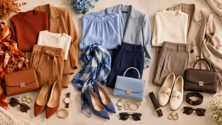
The same outfit formula can feel completely different simply by changing the colour temperature.
Imagine a fitted top, tailored trousers, structured handbag and simple footwear.
Choose rust and camel, and the outfit immediately feels warm and grounded.
Change those shades to pale blue and navy, and the same silhouette becomes cooler and more polished.
Switch everything to cream, taupe and chocolate, and the result becomes understated and versatile.
This is why colour deserves as much attention as silhouette.
Warm outfits create richness
A warm palette is especially effective when several shades share a similar earthy character.
Try combinations such as:
Rust + camel + cream
This is an easy starting point because cream softens the two stronger warm shades.
Terracotta + chocolate brown + tan
The colours remain coordinated while still offering enough depth to prevent the outfit from looking flat.
Mustard + olive + warm beige
This creates a more adventurous palette without relying on extremely bright colour.
Cool outfits create clarity
Cool combinations can feel elegant without requiring complicated styling.
Try:
Powder blue + white + navy
A clean and accessible combination for workwear or smart-casual dressing.
Lavender + cool grey + silver-toned accessories
Soft colour provides interest while grey keeps the look restrained.
Berry + charcoal + pale pink
A useful option when you want colour without making the outfit overly bright.
Neutral outfits create flexibility
Neutral dressing does not have to mean beige from head to toe.
Contrast can make a neutral outfit far more interesting.
For example:
Cream + camel + chocolate
Soft but dimensional.
White + taupe + black
Sharper and more graphic.
Beige + charcoal + ivory
Balanced enough for both casual and smarter outfits.
The secret is varying lightness, texture and proportion rather than expecting colour alone to create interest.
Easy Warm, Cool and Neutral Outfit Formulas
If choosing individual colours feels complicated, begin with formulas rather than rules.
Formula 1: One dominant colour + two neutrals
Choose one colour that attracts attention, then let two neutrals support it.
Examples:
- Rust top + cream trousers + tan bag
- Blue blazer + white top + charcoal trousers
- Berry knit + grey trousers + black shoes
This is one of the easiest ways to introduce colour without making an outfit look busy.
Formula 2: Tonal dressing
Use several versions of the same general colour direction.
A warm tonal outfit might combine camel, beige and chocolate.
A cool version could use sky blue, denim blue and navy.
A neutral version might move from ivory through taupe to deep brown.
Changing value — the relative lightness or darkness of colours — creates separation even when the shades belong to a closely related palette.
Formula 3: Neutral base + colour accent
Start with a reliable neutral outfit, then introduce one coloured piece.
For example:
Black trousers + ivory knit + cobalt bag.
Or:
Cream dress + tan footwear + rust scarf.
This approach is particularly useful if most of your wardrobe is already neutral.
How to Mix Colour Temperatures Without Clashing
Warm and cool colours do not have to remain separate.
In fact, colour theory frequently uses contrast between different parts of the colour wheel to create visual energy. Complementary colours sit opposite one another and create particularly strong contrast.
For clothing, however, you usually do not need maximum contrast.
A more wearable approach is to let one temperature dominate.
Keep one colour family in charge
If most of the outfit is warm, use the cool shade as an accent.
For example:
Camel trousers + cream knit + muted blue bag.
The same principle works in reverse:
Navy suit + pale blue top + warm tan footwear.
The contrast feels intentional rather than accidental.
Use neutrals as a bridge
Neutral shades are particularly useful when two stronger colours do not immediately feel harmonious.
Instead of wearing rust directly with bright cobalt, add ivory, beige or charcoal between them.
The neutral gives the eye a visual break.
Adjust the intensity
Two strong saturated colours can compete.
If one shade is vivid, make the second softer or more muted.
For example:
Bright cobalt + soft beige
often feels easier to wear than:
Bright cobalt + vivid orange.
Colour intensity matters almost as much as temperature.
How to Find Your Most Useful Colour Direction
There is no need to rebuild your wardrobe around a label.
A more practical approach is observation.
Stand near natural daylight and compare different colours close to your face.
Try:
- Warm rust versus cool berry
- Cream versus bright white
- Camel versus cool grey
- Warm brown versus navy
- Gold-toned versus silver-toned accessories
Do not look for a single “correct” answer.
Instead, notice which options make the overall outfit feel more harmonious to you.
You might prefer the way cool colours create contrast around your face.
You might feel more natural in earthy warm shades.
Or you may discover that neutral colours form the best base while both warm and cool accents work well.
Personal colour systems can be useful for inspiration, but they should not stop you wearing a colour you genuinely enjoy.
Your wardrobe also needs to suit your lifestyle, existing clothes, preferred level of contrast and the occasions you dress for.
Build a More Flexible Colour-Led Wardrobe
Once you understand your preferred direction, shopping becomes easier because you can evaluate new pieces against what you already own.
Instead of asking:
“Do I like this colour?”
ask:
“Can I combine this colour with at least three things already in my wardrobe?”
That small change can prevent attractive individual purchases from becoming isolated pieces.
Start with your strongest neutrals
Choose two or three neutrals that work across most of your wardrobe.
For example:
- Cream
- Camel
- Chocolate
or:
- White
- Grey
- Navy
or:
- Ivory
- Taupe
- Black
These become the backbone of your outfits.
Add a small accent palette
Next, choose two or three colours you enjoy wearing.
A warm accent palette might include rust, olive and mustard.
A cool palette might use blue, berry and lavender.
A mixed palette could combine teal, burgundy and warm camel.
The goal is not to create a perfect colour system. It is to make getting dressed easier.
Repeat colours intentionally
When one colour appears in more than one part of an outfit, the look usually feels more coordinated.
A blue blazer can connect naturally with blue details in a scarf.
A tan belt can echo a tan handbag.
Gold-toned jewellery can reinforce a warm brown or rust palette.
These small repetitions often make simple outfits look considered.
Keep room for exceptions
A useful wardrobe system should reduce decision fatigue, not create new restrictions.
If most of your wardrobe is neutral but you love one vivid green dress, keep it.
If warm colours dominate your clothing but a cool blue shirt always works for you, wear it.
Colour categories are tools for coordination. They are not rules you have to obey.
A Simple Colour Strategy That Works
Warm, cool and neutral colours each bring something different to a wardrobe.
Warm tones add richness and energy.
Cool tones can create clarity and calm.
Neutrals provide the structure that makes both easier to wear.
The smartest approach is usually not choosing only one category. It is understanding how each works, then building combinations that suit your clothes, preferences and everyday life.
Start with a reliable neutral base, identify a few warm or cool shades you genuinely enjoy, and repeat those colours across your wardrobe.
That is often enough to make outfit planning feel much more intentional.
FAQs
What are warm vs cool vs neutral colours in fashion?
Warm vs cool vs neutral colours describe different colour-temperature groups used in styling. Warm shades often include reds, oranges and yellows; cool shades include blues, greens and violets; neutrals commonly include black, white, grey, beige, taupe and brown.
Can I wear both warm and cool colours together?
Yes. Let one colour temperature dominate and use the other as an accent. Adding a neutral such as cream, grey, beige or navy can help connect the two.
Are beige and brown always neutral colours?
In practical fashion styling they are usually treated as neutrals, although individual beige and brown shades can lean warmer or cooler depending on their undertones.
Do neutral outfits have to look plain?
No. Use contrasting light and dark neutrals, varied textures, accessories and different proportions. Cream with chocolate, for example, creates more depth than using one beige shade throughout.
Should I only buy colours that match my colour season?
Not necessarily. Personal colour systems can be useful guides, but wardrobe versatility, personal preference and how a colour works with your existing clothes are equally important.